Wedding colours. Choosing them can be a little tricky if you don’t have an absolutely fave hue. So where do you go about getting your wedding colour inspiration?
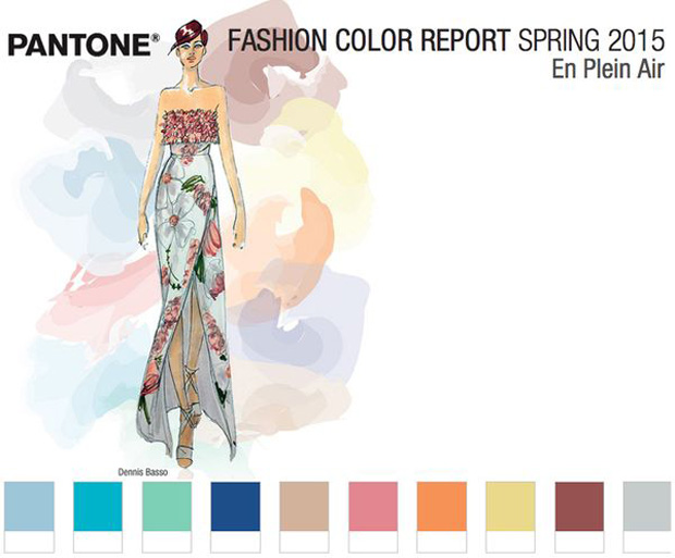
Well, those lovely folks over at Pantone produce a colour report for each of the seasons, and not long ago Pantone came up with their Pantone Spring Colour Report for Spring 2015.
So what does it all mean for weddings? Today I share those colour ideas with you in a two part series that will hopefully give you that colour inspiration to inspire and start planning your big day!
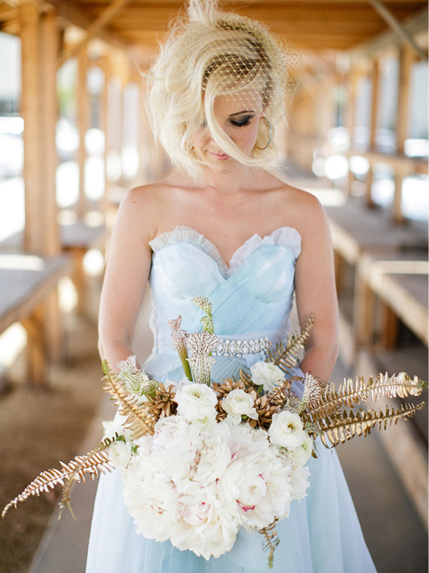
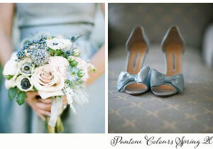
Aquamarine
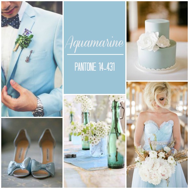
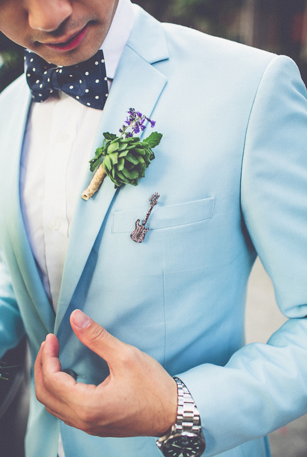
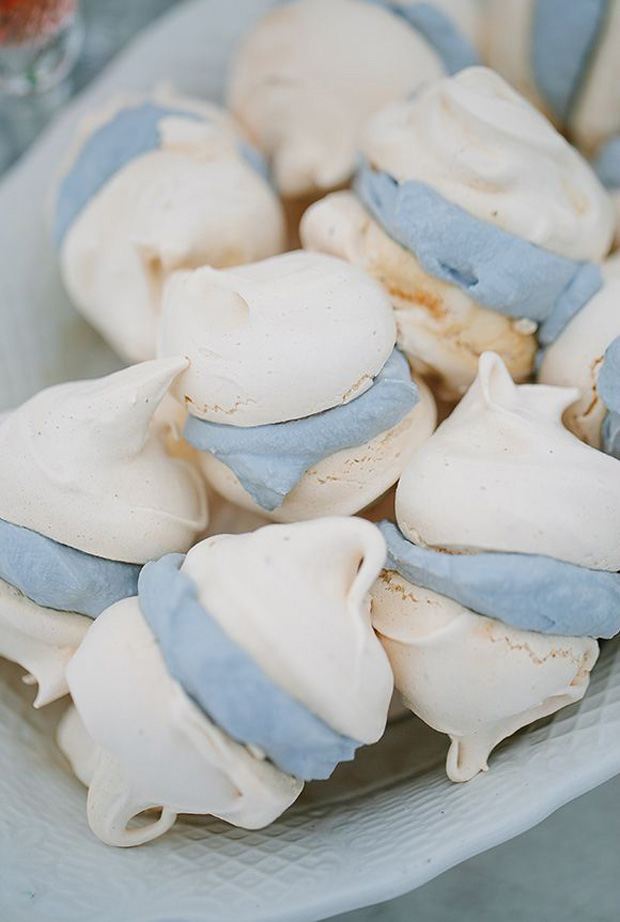
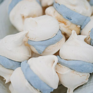
Aquamarine is a pale blue colour that makes you think of the sea. Slightly muted with a touch of dusky blue, this colour has a lovely soft tone that’s perfect for weddings.
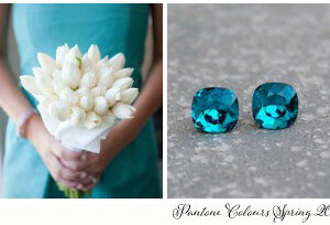
Scuba Blue
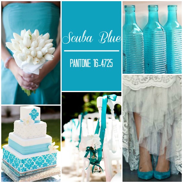
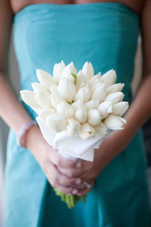
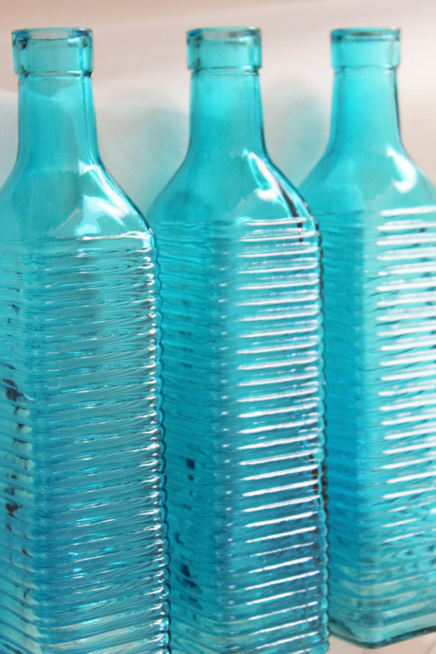
Staying with the colours of the sea, Scuba Blue is a much more vibrant shade of blue, a kind of cross between a teal blue and turquoise. So pretty and definitely a bolder colour choice.
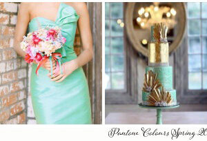
Lucite Green
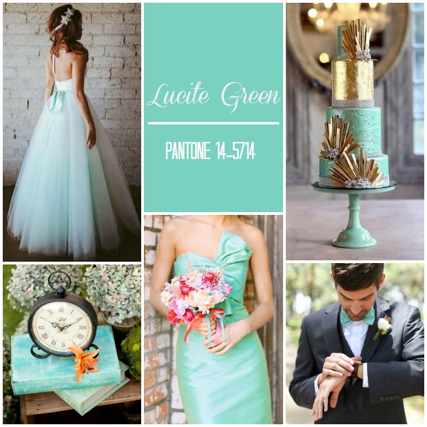
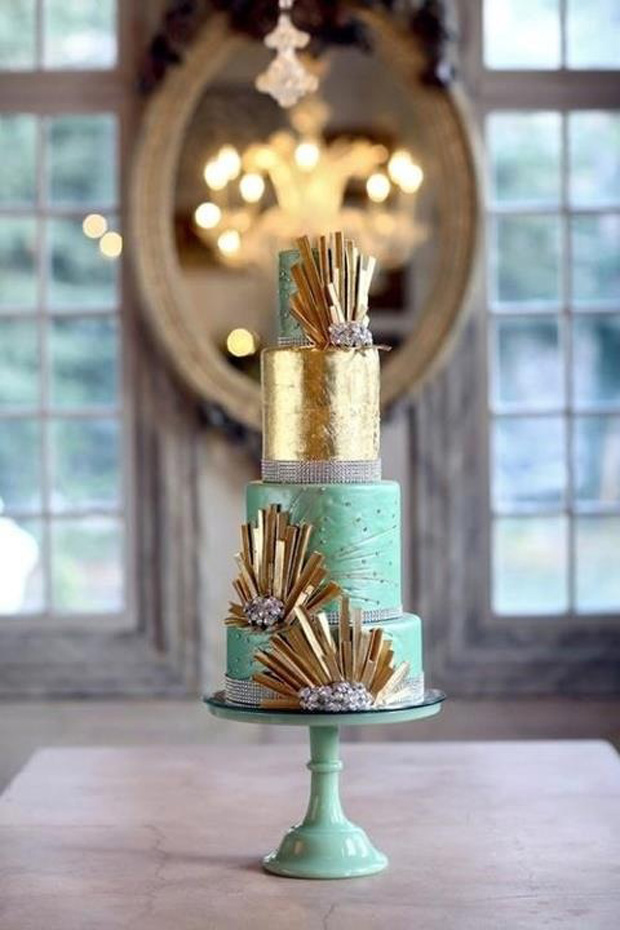
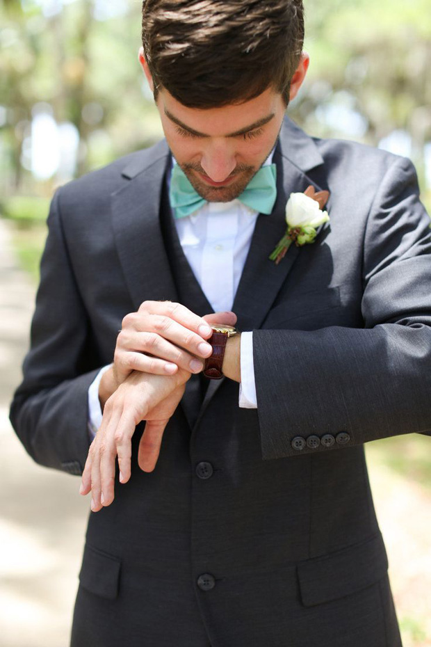
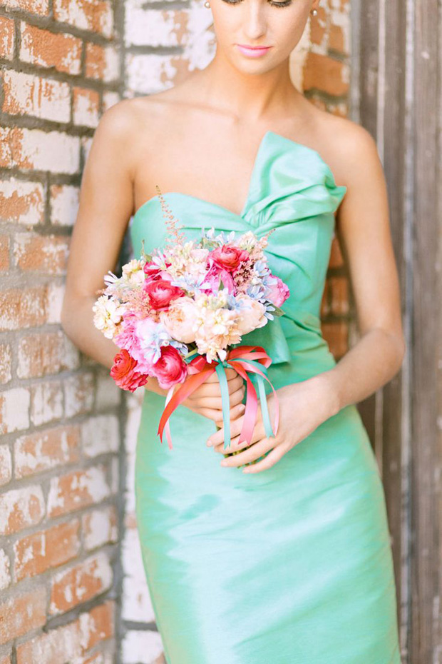
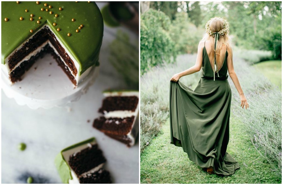
Lucite green is a fresh and pretty wedding colour choice with a fashion forward metallic sheen. A cross between mint and greyed jade with a pearlescent finish.
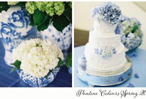
Classic Blue
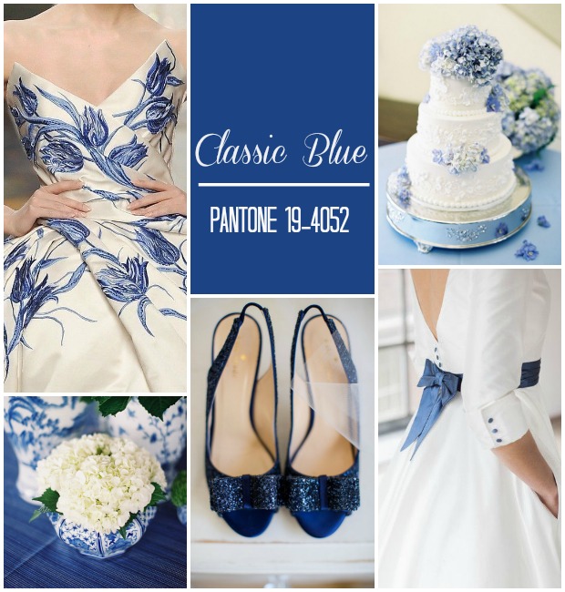
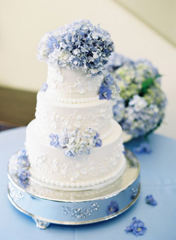
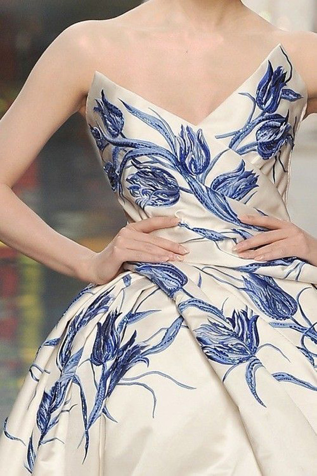
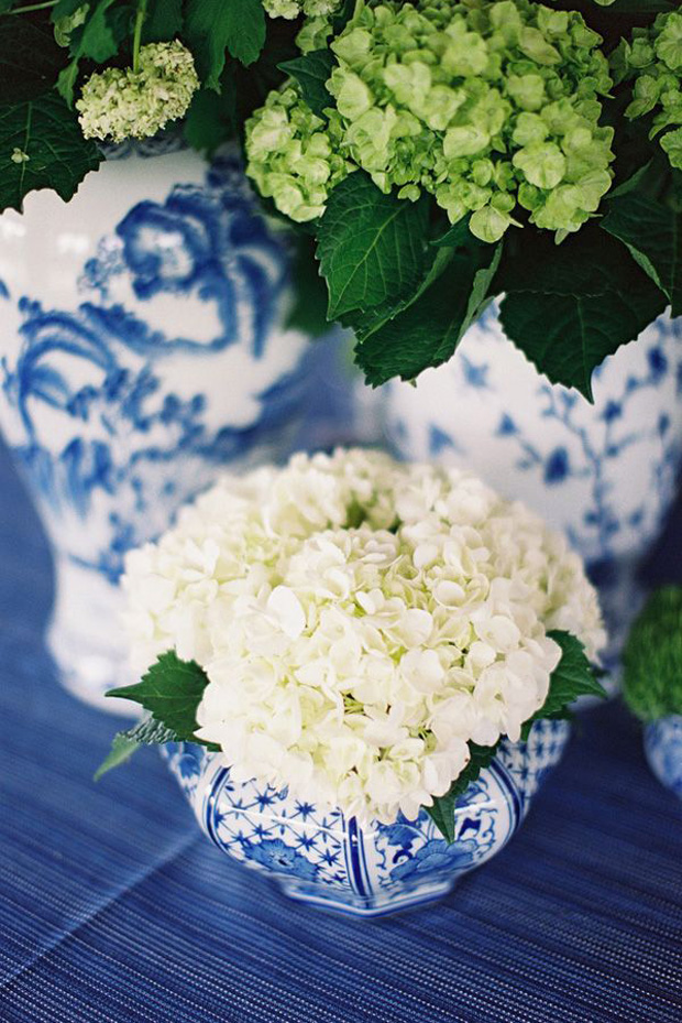
Staying with the blues. Our next Spring Pantone Colour for 2015 is Classic Blue. Elegant, bold and quite traditional this classic blue makes me think of the French print Toile de Jouy.
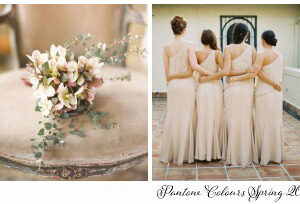
Toasted Almond
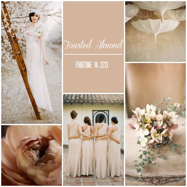
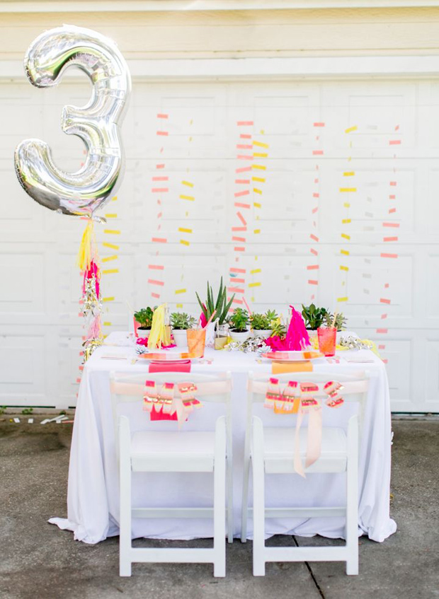
I absolutely love this colour choice and think it will be very popular for 2015 weddings. Neutrals will be big wedding news and are a very chic option for brides looking for an understated wedding style. If you want a bold, bold colour statement check out this neon and neutral wedding board.
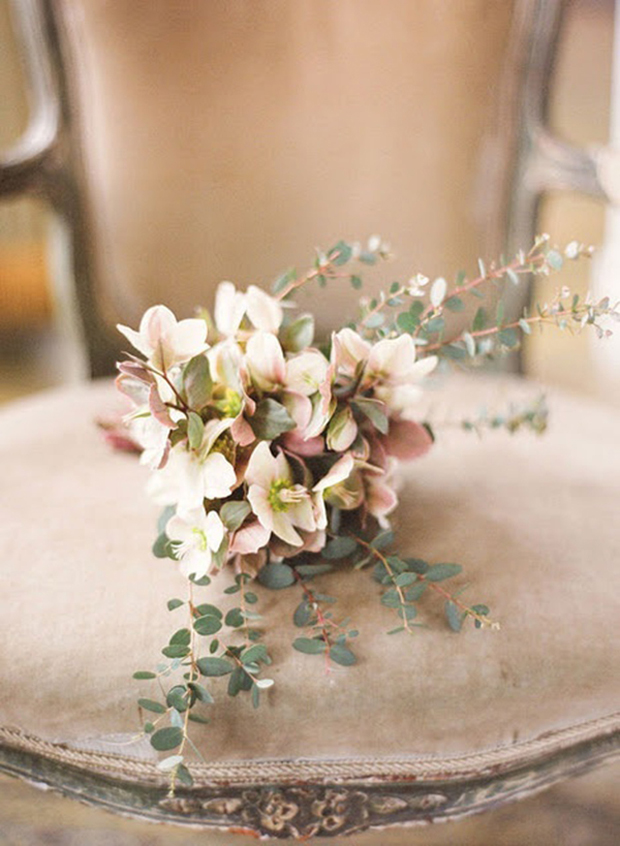
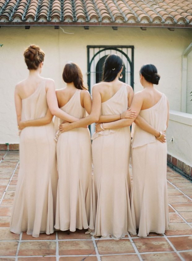
So there you have it lovelies, part one of my Pantone Colour report for spring 2015. What do you think?
Are you inspired? I do hope so. I’ll share part two with you real soon.
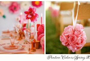
 View the Gallery


Fabulous piece with some beautiful ideas for use of the colours.
Thanks Sian! XxX
Comments are closed.