But it doesn’t all have to be pretty pastels and Easter themes. Sure, these colours will always play a big role in Spring Weddings but seeing as 2018 is set to be a big year for going bold and being brave, we are reflecting that in our choices for this year’s Spring shades.
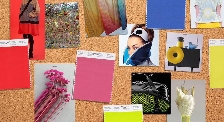
Each year the Pantone Color Institute evaluates the colours in the collections of fashion designers at New York Fashion Week and London Fashion Week and creates the PANTONE Fashion Color Trend Report. With colour on the catwalk being a key indicator of the colour stories we can expect to see showing up across all areas of design, it is no surprise that the chosen shades will be sure to make an appearance in the trendiest of weddings. This year is all about complex colour combinations, embracing the unexpected and showcasing a sense of fun, energy and optimism.
With seasonal borders being much of a non-issue when it comes to colour choices these days, it makes it that bit harder to identify an appropriate palette for your big day. So, we have put together a few colour palettes for you which will hopefully provide you with some inspiration and direction for your wedding design. The most important thing to remember is not to feel limited by traditional guidelines or rules and to find the palette that perfectly reflects you as a couple, your story and the feeling that you want to evoke for your special day.
This is the perfect colour palette if you are trying to create an atmosphere that is friendly, sociable and uplifting; and if you’re a people person and a free spirit that would love to incorporate a sense of adventure into your wedding day.
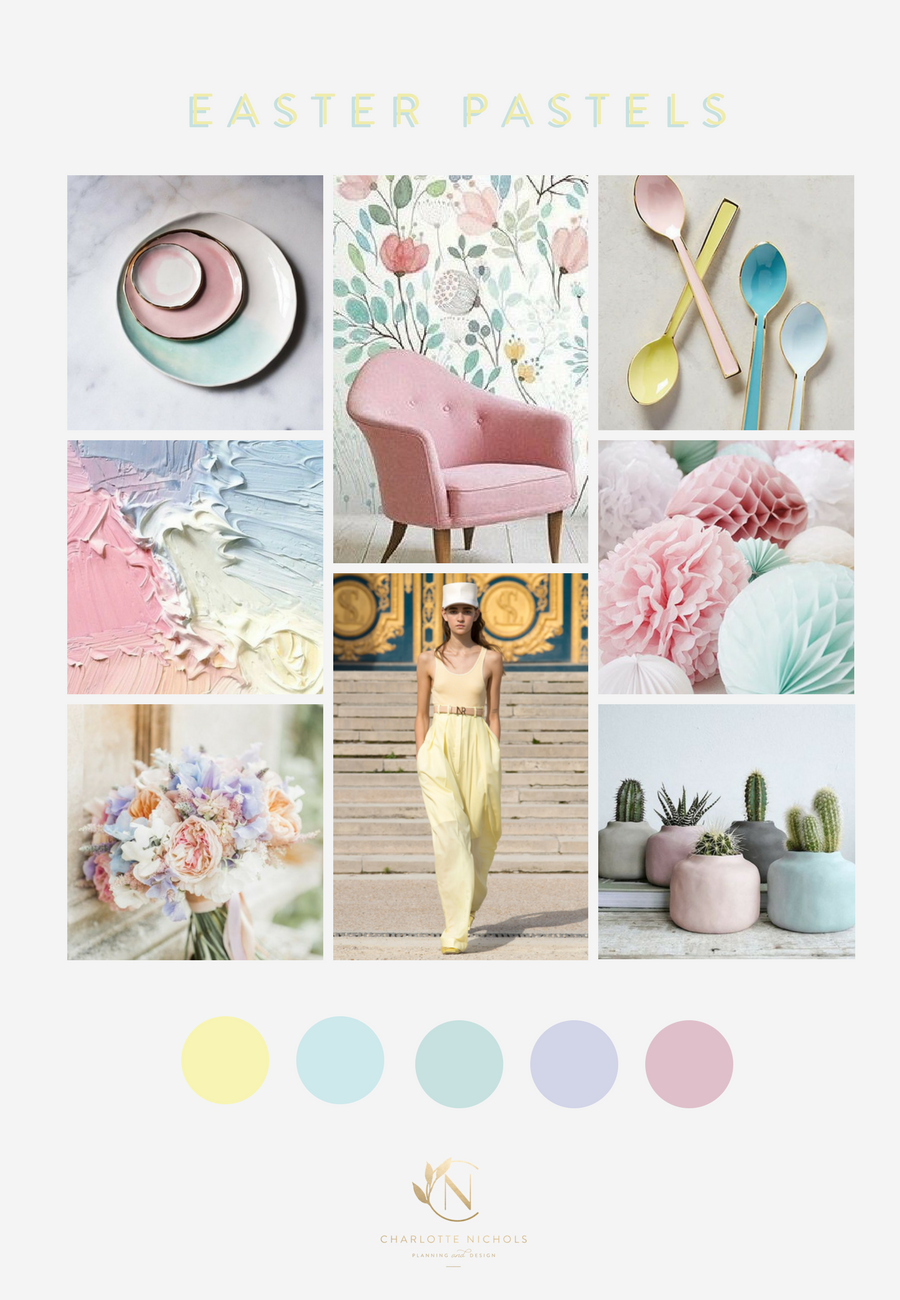
Definitely for the romantics, those that want a relaxed, friendly and cheerful gathering. You may want to focus on just a few pastel shades or go pastel crazy and include the whole lot. You just want to make sure that it doesn’t feel too much like a kids party and a bit too sickly bubblegum sweet.
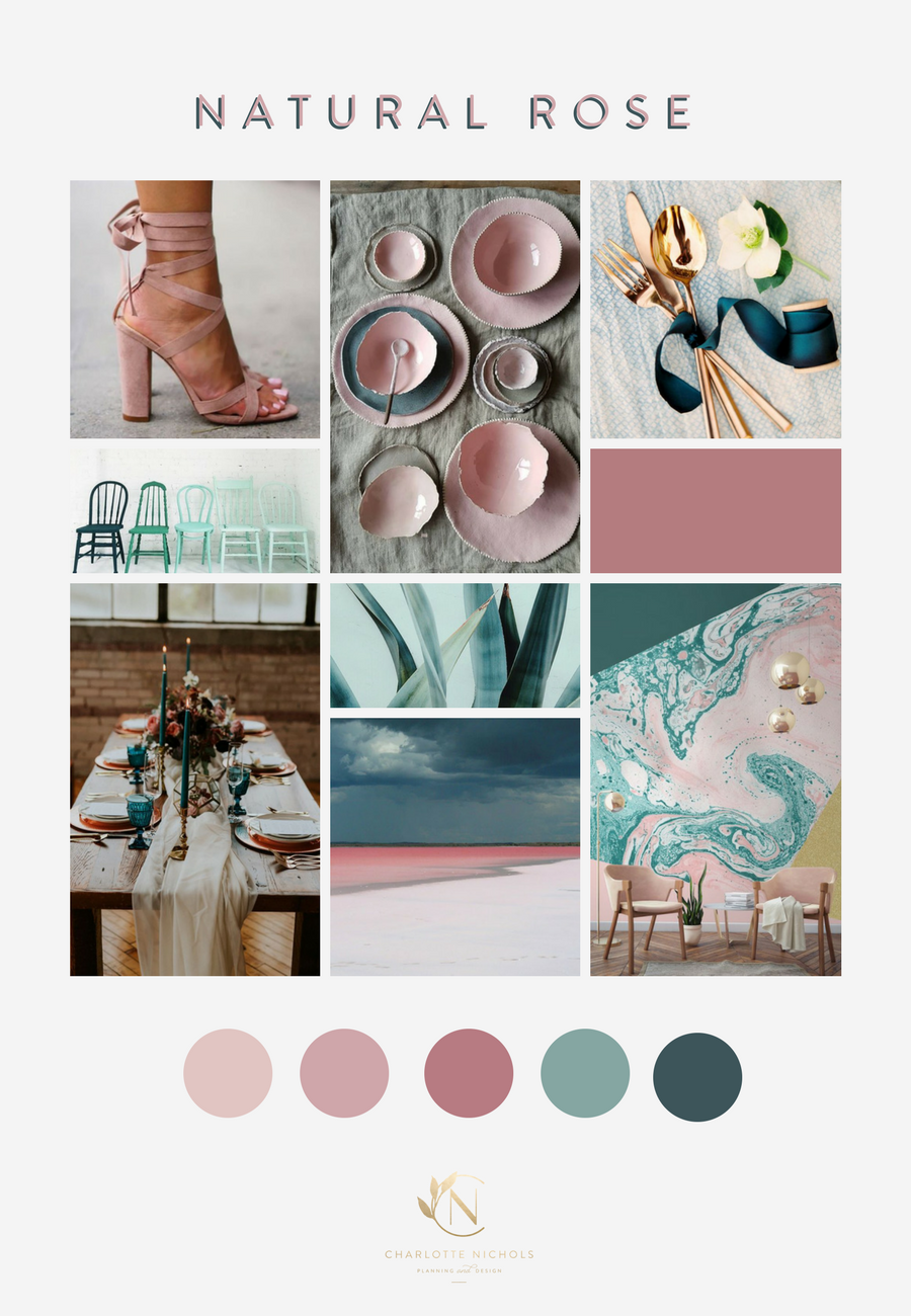
Pink and green is a tried and tested colour combination and is often a good compromise between husband and wife (!) and if you want to achieve a delicate, pretty style yet don’t want it to be overly feminine. This deep teal-y green that I have chosen is a combination of blue and green. Blue positively communicates feelings of tranquillity and calm, whilst green positively evokes feelings of peace and balance. This colour combo is for a laid-back couple who care about style.
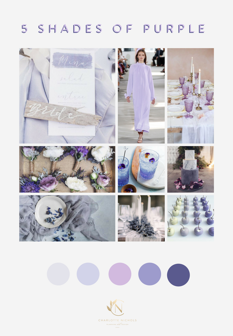
In general, purple will create a mood of individuality, mystery and fantasy. However, there are a number of different shades you could choose, from a soft lilac to a mid-Lavender, to a deep plum. In general, the softer and lighter you go the more you are saying romance, femininity and (sometimes) sensitivity and immaturity. On the other hand, deeper purples can be related to power, compassion, eccentricity and notability.
But it is safe to say that if you choose to go down the purple route, you are unique, independent and this is 100% your wedding day.
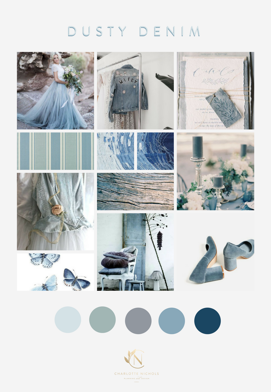
Weddings are increasingly becoming about embracing individuality, and also couples are opting for a more laid-back luxe vibe as opposed to tradition and formality. As such, brides are choosing to incorporate their every day into their wedding, so that it feels uniquely them. Throwing on a casual denim jacket over your wedding gown, thinking about how you live in your home and what makes you feel at your happiest and relaxed is what this palette is all about.
It is dusty, understated and informal yet plays on the key qualities of a blue concept such as tranquility, reliability and serenity. The darker blue you go the more you will be introducing a sense of masculinity and conservativeness while lighter blues are all about freedom and creativity.So, what do you think? What would be your chosen palette?
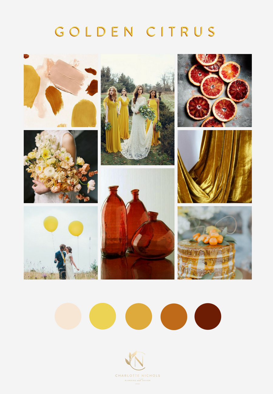
Do you feel like you could use a hand discovering your unique wedding style and colour palette? I will bring a thoughtful and design-led approach to planning your wedding. Understanding my couples is paramount to my process, and our creative collaboration will help you embrace your own individual style and tell your unique story, resulting in an event experience that it the perfect reflection of you as a couple. By asking you the right questions, and together digging deep into who you are as a couple, your likes and dislikes, and how you would visualise your perfect day, I am able to create a meaningful and impactful design concept. This will include a custom colour palette, digital mood board and wedding lookbook. If you are keen to find out how we might be able to help, please get in touch or contact me directly via email on [email protected]. I would love to help you bring your vision to life!MOOD BOARD 1: GOLDEN CITRUS
Paint colour by Jasmine Dowling | Bridal party photography by This Modern Romance | Orange still life by Mowielicious | Bouquet photography by Anna Peters Photography | Vases via Happy Buddha Breathing | Velvet draping via Pinterest | Couple with balloons photography by Nicola Thompson | Drip cake photography by Courtney Elizabeth
MOOD BOARD 2: EASTER PASTELS
Plates by Suite One Studio | Chair via Pinterest | Spoons by Anthropologie | Paint | Paper pom poms by The Wedding of My Dreams | Bouquet photography by Naomi Kenton | Yellow outfit by Nina Ricci | Cactus vases by Lilac Coast
MOOD BOARD 3: NATURAL ROSE
Shoes by FSJ Shoes | Crockery by Its A Jook |Cutlery & Ribbon via Style Me Pretty | Chairs photography by Leslie Shewring | Leaves by Arlene Hacatoryan Studio | Tablescape by Kate Touzel | Beach photography by Melissa Mercier | Interiors by Everwallpaper
MOOD BOARD 4: 5 SHADES OF PURPLE
Menu photography by Lauren Werkheiser | Lilac Dress by Tibi | Tablescape photography by Amanda Karen Photography | Buttonholes via Shindig Chic Creations | Drinks by Hungry Girl Por Vida | Cake photography by Zahra Creative |Still life by Silk & Willow |Lavender Runner photography by Melanie Gabrielle |Apple decoration via You & Your Wedding
MOOD BOARD 5: DUSTY DENIM
Blue skirt by Rdevine | Wifey Denim Jacket photography by White Magazine | Stationery Suite photography by Jenna Mcelroy | Striped pattern by Vanessa Arbuthnott | Tablescape photography by Melanie Gabrielle | Denim top via Pinterest | Butterflies via Chasing Rainbows Forever | Interiors by Tine K Home | Shoes by Zara
All mood boards designed by Charlotte Nichols Weddings